Right now, as I gaze out my window into the wood, the trees are singing to me. By this I mean that as the light dances in the leaves as the early morning sunlight strokes, there is a “holy trinity” and a “holy communion” between the creator who has sent his light to the leaves, the color in the leaves vibrating (they really are dancing!) in that certain light as it travels to my heart, and my heart in turn sending love and gratitude to the Creator. Another beautiful moment in time has been given to me and to anyone who will look for it. God can present it to us, but he can’t make us look. This is the beauty of our co-creator part in our own lives. We can look and see, or we can not look and…
Of all the places in all the world in all the universe I could be right now, there can be none more beautiful, and my heart is filled with joy that I am so blessed to have it. That God is full of such profound beauty and that he allows us to share in that. In fact, he inspires some of us to try to create some beauty of our own through the arts. or kindness to each other. and by the other I mean all things, living and non-living. A brief tangent to say there is great kindness and love and creativity and beauty shown by a buddhist monk as he rakes the same gravel paths in his garden each day, is there not? and so on. Caring for God’s creation — all of it.
But back to color. Which is more beautiful, the orange, the gold, the burgundy leaves against the green ones that are resisting nature’s call? Don’t they all play their role in the symphony which would be poorer in their absence?

The best book I have found to discuss how we see color has been written by Joseph Albers, originally published in 1963. He says:
“In visual perception a color is almost never seen as it really is — as it physically is. This fact makes color the most relative medium in art.
In order to use color effectively it is necessary to recognize that color deceives continually. To this end, the beginning is not a study of color systems.
First, it should be learned that one and the same color evokes innumerable readings. Instead of mechanically applying or merely implying laws and rules of color harmony, distinct color effects are produced-through recognition of the interaction of color-by making, for instance, two very different colors look alike, or nearly alike.”
And it strikes me that people have very much adopted the very same techniques on a psychological/sociological plane to do all sorts of the same things with themselves:
- we wear black to business meetings to appear more powerful, especially if we are women
- we try to “blend in” to a group of people when we don’t want to be seen
- someone may choose to wear a striking color or outfit to a function to “stand out”
colors clash, harmonize, soften, contrast and just about communicate the full spectrum of any human emotion that can be described. We even utilize this concept within our language as when we might tell someone that they need to “tone down” their speech.”
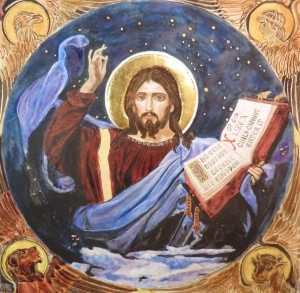
What does all of this have to do with iconography? Nothing…and everything. I’m nothing if not a dialectic. (smile) The color in an icon speaks to us almost before specific image does. The color and the geometria. But that topic is for another time. Over centuries we have come to see icons with the eyes of our hearts before we see them with the eyes of our heads. Just as we pray the Jesus Prayer in our hearts and not in our minds, that is the place that we see icons. And we know two things about the color red. Living humans have red blood coursing through their veins, and the dying Christ was bloodied as he died upon the cross. Within him, blood was both a human and a mystical element. And so red is the most powerful color used within icon painting. Those who are interested can pursue the physics of the vibration of the color red, but for the rest of us it is enough to know the color red indicates the human nature of the Christ, while a blue garment speaks to his Godly nature. And this is the reason these are the two oft most colors in his garments.
see my icons at http://www.frangelicoblueicons.com


You must be logged in to post a comment.